DRENCH yourself in the spectrum
Liz West's optically vibrant and kaleidoscopic installations

Colour Transfer, 2018 by Liz West

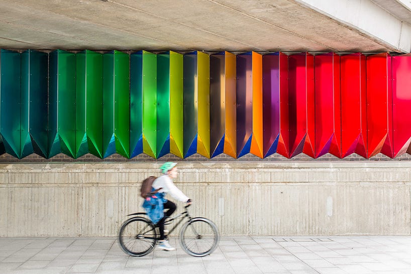
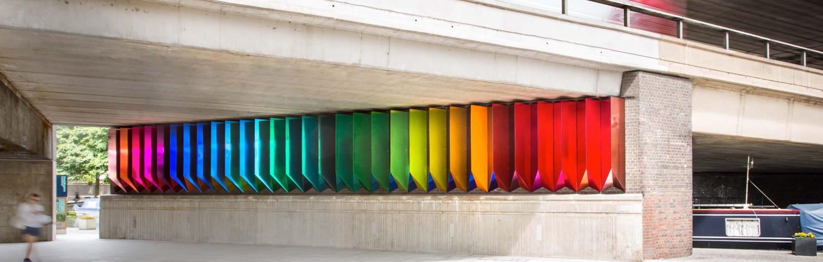
Steel, Aluminium, and PVC, images by jason bailey
Colour Transfer is a permanent artwork spanning the underside of Paddington Central’s Westway Bridge, commissioned in 2016 by British Land, London. The work comprises multiple angled coloured mirrors, vertically spanning the height of the brickwork to create an optically vibrant and kaleidoscopic installation. The prismatic shapes mirror the tunnel’s architecture. The colours in the work change depending on where you are within the tunnel. As visitors move, they encounter the fluctuating effect of light and reflections created by the coloured mirrors.
See


Presence, Site-specific installation 2021 situated in Christ Church in Macclesfield. Photography © Liz West and Travelling SimonPhoto by Sam Kittner
Presence transforms the space taking the form of a tunnel creating a kaleidoscopic artery down the centre of the church. The tunnel is made up of 450 squares covered in the colour transmitting dichroic film, which is open at one end to allow visitors to walk in it and become immersed in the work. One side of the tunnel features cool colours ranging from purples to greens and blues, and on the other, they will be warm corals, pinks, and yellows. The reflective and refractive nature of the material projects coloured light across the entire space, helping to reveal parts of the architecture that may otherwise be missed.
Gradient Remix Installation (LED lamps, paint, wood) 2022
Gradient Remix is a permanent multi-room immersive installation developed for Color Factory, Chicago, USA. This installation comprises a series of six chambers that use lights and mirrors to showcase and immerse visitors in the phenomena of colour mixing. As two colours merge and multiply in each room, they combine to form secondary colours that spill out into the spaces between each chamber. The colours wash over visitors as blends emerge around bends and mirrors extend beyond horizons. Gradient Remix triggers and activates the viewer's senses and plays on the notion of colour as a physical material exaggerated by the use of infinity mirrors to further enhance the sensory experience.


Iri-Descent
Polycarbonate, dichroic film, aluminium, stainless steel 225cm (L) x 810cm (H) x 225cm (W) 2019Iri-Descent was commissioned by London Design Festival, supported by Fortnum & Mason. Photographs © Aleksi Nurminen / Andy Stagg
Iri-Descent is an ambitious work made from a vast arrangement of delicate suspended cubes covered in colour transmitting dichroic film. Iri-Descent consists of 150 skeleton-framework cubes that descend through the space clad with highly reflective and luminous dichroic film in two differing colour ways, which mirrors and sheds light on its surrounds. The cubes appear to change colour as visitors move around the work. There are two colour variations that systematically alternate throughout – warm and cool – offering a diverse range of hues. Iri-Descent forms part of an ongoing series of spatial light works based upon research into colour theory and light fields with an ambition to transform architectural spaces and public environments. With Iri-Descent, she wants to encourage visitors to engage with the space in a new way and to examine their own personal relationship to colour and light.
Say
Does experiencing color influence the way you feel?
What does it feel like to be inside a rainbow?

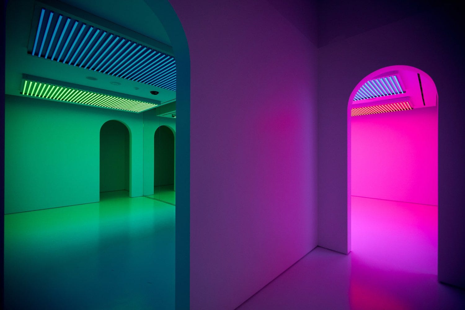
Our Colour, Site-specific Installation (T5 fluorescent bulbs, cellulose gels)
For the 2016 edition of the Bristol Biennial, British artist Liz West invited visitors to drench themselves in the spectrum. West transformed architectural space and turned colour into an immersive and embodied experience by refracting light through carefully arranged coloured theatre gels. A vivid world was created, exploring human visual perception and how colour affects our emotions and our bodies.(liz-west.com)
If you were in the Our Colour Exhibit, which colors would you be drawn to most? Why? How might it feel?

Do

Need a few moments of visual tranquility? Download I Love HUE to arrange mosaics of colored tiles into perfectly ordered spectrums. Android and IOS
Did you know the human eye sees green better than any color in the spectrum? Read: Why we all need green in our Lives.
Remember this?
About Liz West:

Liz West (b.1985) is a British artist known for her wide-ranging works, from the intimate to the monumental. Using a variety of materials and exploring the use of light, she blurs the boundaries between sculpture, architecture, design, and painting to create works that are both playful and immersive.
West creates vivid environments that mix luminous colour and radiant light. West aims to provoke a heightened sensory awareness in the viewer through her works. She is interested in exploring how sensory phenomena can invoke psychological and physical responses that tap into our own deeply entrenched relationships to colour. West's investigation into the relationship between colour and light is often realised through an engagement between materiality and a given site. Our understanding of colour can only be realised through the presence of light. By playing and adjusting colour, West brings out the intensity and composition of her spatial arrangements.
West has been commissioned worldwide by institutions and organisations, including Natural History Museum, London Design Festival, Paris Fashion Week, Milan Design Week, National Trust, National Science and Media Museum, Dubai Design Week, Natural England, Salford University, Fortnum & Mason, and Bristol Biennial. West’s work has been included in exhibitions at St Albans Museum + Gallery, Chester Cathedral, Compton Verney, Musée Nissim de Camondo in Paris, Kraftwerk Berlin, Tripostal Lille, and Bangalore International Centre. (liz-west.com)
Please share your reflections with me by replying to this post and tagging my Wonder Wander Facebook or Instagram pages!